Thursday, 5 March 2009
Production Meeting
This lesson we have been adding the finishing touches to our opening sequence. Rob has been making the soundtrack for the sequence using garage band. Whilst Jon has diligently been editing the sequence, adding titles and making sure that the sequence is in the right order. Myself and Jordan have been editing the freeze frame titles, inserting silhouettes of the characters in front of a comic style background using Photoshop.
By the end of this lesson we hope to have achieved a finished opening seqences, edited, with a soundtrack and hopefully if achieved with a narration. The narration will hopefully explain the story line and will be achieved by Jordon doing a voice over.
Monday, 2 March 2009
Thursday, 26 February 2009
Thursday Work
We did a lot of editing work today. Jon has been relentlessly been using gamma, brightness and contrast to make the editing look more authentic. We managed to get a clip from part of our film and successfully put our editing to it. You'll see the editing work on the rough cut on monday.
Jordan came in at 9am, yesterday she was not in. Though, this was not intentional as she has had drama trips. Lottie has come in today and given us some good advice and help on the editing.
Rob has been doing the music and has done 72 seconds so far (1:12). Might need to make it longer which should be hard. =/
We have been looking up different types of fonts from www.dafont.com they have great fonts there and we might be using 'Comic Book' as the font.
Thursday, 12 February 2009
This is the script so far:
The Filmores
The Filmores
OPENING SEQUENCE
Starting out in a dark, narrow and dreary alleyway. The setting is of 1930s style architecture showing little light, a few windows and a few bins. A cold wind shivers through the air as the temperatures drop in what is supposed to be some of the worst economic and financial times the United States has ever had to face.
{ENTER Don}
Don is found running fast past the camera showing half of his face to the audience whilst facing towards the end of the alleyway being chased. He is holding in his left hand a briefcase.
[Don breaths heavily]
{ENTER Mafiaman}
Running after Don because Don has stolen his brief case off him. Wearing a clean cut suit showing off that he means business in these desperate times.
~ Rob
Wednesday, 11 February 2009
Prop-list and costume list
Location ideas
We have been looking at various locations that will may use to film. All of the photos are from Google Maps in satellite mode. All of our locations are in cambridge because it is easy to organise transport.
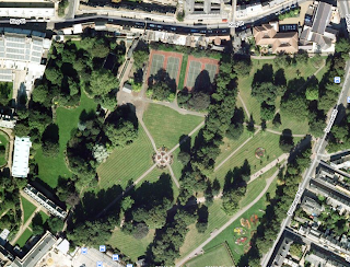
Christs Piece
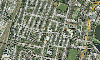
Mill Road
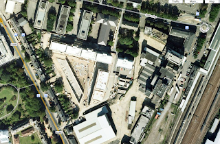
Apartment Buildings near the Train Station
Thursday, 29 January 2009
More comic book style fonts.

 We have decided to have the titles for our opening sequence in a comic book style font.
We are also going to have the date shown in a comic book font in the beginning of our opening sequence like a comic book.
Here are some photos of cartoon fonts and styles.
Labels: Jordan
Research on editing styles.
 Cartoon effect from the website using line art and posterize.
For our opening sequence we want to have a comic book kind of look in some parts of our scenes when we are introducing the different characters.
We went on the internet and found a website explaining how to apply a cartoon effect on final cut.
The website is: http://www.kenstone.net/fcp_homepage/creating_cartoon_douglas.html
The only problem with this website however is that the person had used final cut pro which we do not have and therefore didn't have one of the effects (line art) that he had used in the tutorial.
So our test footage does not include line art but we looked and added other effects which turned out to give a black and white cartoon effect.
Our Test Footage:
Thursdays lesson.
Today our animatic deadline is due. Myself and Jon have been taking photos of our storyboard using the mac camera and now we are working on our animatic using final cut.
Soon we will be using garageband so we have a soundtrack for our animatic.
The animatic has to be about a minute long while our final opening sequence has to be two mintues.
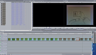
Editing our Animatic
Wednesday's lesson.
On Wednesdays lesson we worked on our storyboards so we could start on our animatic which is due today (Thursday). We also did some research based on the feedback we got. We researched the 1920s and 1930s which our sequence is set in that time.
Jon worked on our storyboard while myself and Rob did some 1930s comic book research.
Wednesday, 28 January 2009
1930s clothing research.
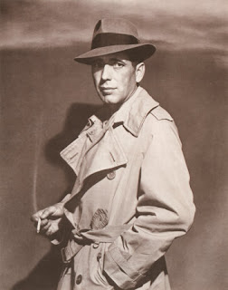
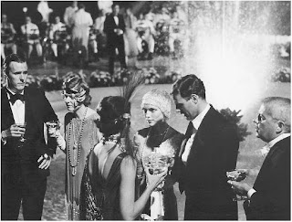
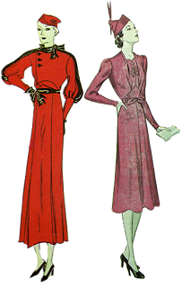
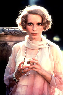
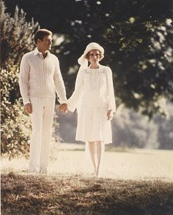
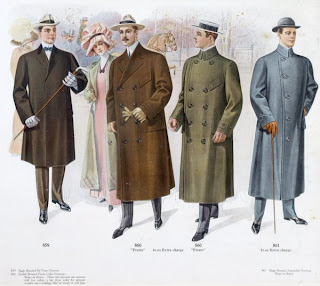
We have set our crime caper opening sequence in the 1930s so we need to research the type of clothing that was worn in this era so our costumes for this sequence look genuine.
The great gatsby was a book written by Scott Fitzgerald and was set during the jazz age. The book was made into a film and some of the pictures from our research are from the film with the actors dressed in typical jazz age (1920s-30s) costumes. The fashionable haircut for the women was to have it short and crimped (see pictures). The trench coat was also very common for this era.
Labels: Jordan
Sunday, 18 January 2009
She's All That opening sequence analysis (Rom Com)
The credits in this sequence merge from paint that the main character squirts onto some newspaper. The paint can connect to what happens to the main charcter during the film(she has a makeover). The painting shows that this character is very artistic and by what she is painting shows she is different and sort of an out cast from her 'normal' stereotypical peers. This is very conventional of a romantic comedy, because the out cast is always the main character and is then transformed into a 'popular' person and also falls in love with a person who is completely opposite from them in the 'social school scale' and usually a jock. This is exactly what happens in this film and it can be seen by the opening sequence. The main character's appearence for examle her glasses shows the stereotypical out cast character.
In the opening sequence the location is shown and it's a high school which is again typical of a teenage romantic comedy, because this is where most teenagers spend most of their time. The other typical stereotypical characters are also shown in this opening sequence such as the 'bitch' and the popular jock chacter.
The music in this sequence is very typical for a rom com too. It's very up beat and appeals to most teenagers tastes.
Finally during the whole opening sequence each character/stereotype are introduced subtly like in conversation so the viewrs are aware of the socal stereotypes.
:-)
Labels: Jordan


