The Filmores
posted by AS Media Student at 05:12
![]()
This lesson we have been adding the finishing touches to our opening sequence. Rob has been making the soundtrack for the sequence using garage band. Whilst Jon has diligently been editing the sequence, adding titles and making sure that the sequence is in the right order. Myself and Jordan have been editing the freeze frame titles, inserting silhouettes of the characters in front of a comic style background using Photoshop.
posted by AS Media Student at 01:46
![]()
Here is our roughcut. It has just about got all of the editing done, it just needs final trimming, adding the grayscale cartoon effect, to have titles added and to place the soundtrack onto the sequence.
posted by AS Media Student at 07:20
![]()
posted by AS Media Student at 02:21
![]()
On Friday we filmed the alleyway scene at Christ Piece. We filmed all of the alleyway scene and the introduction of Antonio Accardo.
posted by AS Media Student at 03:23
![]()
On Wednesday we stated to film some of our opening sequence. We decided to film the last section of the opening sequence which is the indoor scenes before we filmed the alleyway scenes. The only section that we had to change was the scene when we introduced Antonio Accardo. This was because the actor who we were going to film couldn't make it to the filming on wednesday so we adapted this to be able to film it at on Friday 20th February.
posted by AS Media Student at 03:13
![]()
For our Locations we chose to film the most in Christ Peace. This was because we found an Alleyway which doesn't have a time period associated with it but also it allowed us to not give it away that we weren't in the 1930's because there were no cars or modern shops in the area that we filmed.


posted by AS Media Student at 02:56
![]()
posted by AS Media Student at 01:51
![]()
I've spent the last 20 minutes taking shots and uploading the Storyboard Clips. These are important because they depict what we would like to include in our opening sequence.


posted by AS Media Student at 01:38
![]()
Yesterday we created a Risk Assessment Form to make sure that we have identified some of the potential hazards that we could encounter during production.

posted by AS Media Student at 01:08
![]()
Our props will consist of:


posted by AS Media Student at 03:41
![]()
As part of the filming preparation we have been given forms that we need to get all the actors to fill in to allow us to release footage on them.

posted by AS Media Student at 03:29
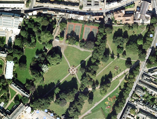
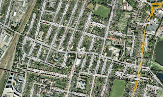
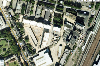
![]()
We have been looking at various locations that will may use to film. All of the photos are from Google Maps in satellite mode. All of our locations are in cambridge because it is easy to organise transport.
posted by AS Media Student at 03:17
![]()
In response to the feedback that we had received after our blog had been shown to other members of the class was that of positive response. We had been told that we had included many in depth analyses; we had managed to convey that of a good amount of research which had had been undertaken into each genre in order to consider which one to choose. Positive feedback was also given for our mood board, as it was said to have had a good use of pictures, which was again able to convey to a viewer the mood of our project, which was to be a jazzy, 1930’s and 'swinging’ mood. Our Ident was also praised, as it seemed appealing to the viewer and interesting due to the animation created by our group.
Labels: Lottie
posted by AS Media Student at 03:55
![]()
Labels: Jon
posted by AS Media Student at 08:13
![]()
Labels: Jon
posted by AS Media Student at 12:48
![]()
Here is our animatic, please enjoy viewing it.
posted by AS Media Student at 02:30
![]()

 We have decided to have the titles for our opening sequence in a comic book style font.
Labels: Jordan
posted by AS Media Student at 02:13
![]()
 Cartoon effect from the website using line art and posterize.
posted by AS Media Student at 01:51
![]()
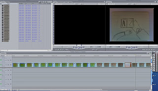
Today our animatic deadline is due. Myself and Jon have been taking photos of our storyboard using the mac camera and now we are working on our animatic using final cut.
posted by AS Media Student at 01:35
![]()
On Wednesdays lesson we worked on our storyboards so we could start on our animatic which is due today (Thursday). We also did some research based on the feedback we got. We researched the 1920s and 1930s which our sequence is set in that time.
posted by AS Media Student at 01:25
![]()


Labels: Jordan
posted by AS Media Student at 13:00
![]()


posted by AS Media Student at 03:39
![]()
We got some constructive criticism from our pitch that we did on monday.
posted by AS Media Student at 03:22
![]()

posted by AS Media Student at 02:28
![]()
Labels: Jordan
posted by AS Media Student at 11:31
![]()
For my opening sequence I analysed the title sequence of the Italian Job (2003 version).
Labels: Jon
posted by AS Media Student at 11:13
![]()
Opening Sequence of Quantum of Solace
posted by AS Media Student at 06:05
![]()
Here is our final logo. It has been created in photoshop and then animated in final cut express. Rob edited the sound to make it fade in and out in garageband.
posted by AS Media Student at 02:24
![]()
Hello everyone we are group T2 61 and we consist of 4 members which are: Jordan, Lottie, Robert and Jon.
posted by AS Media Student at 05:43
![]()